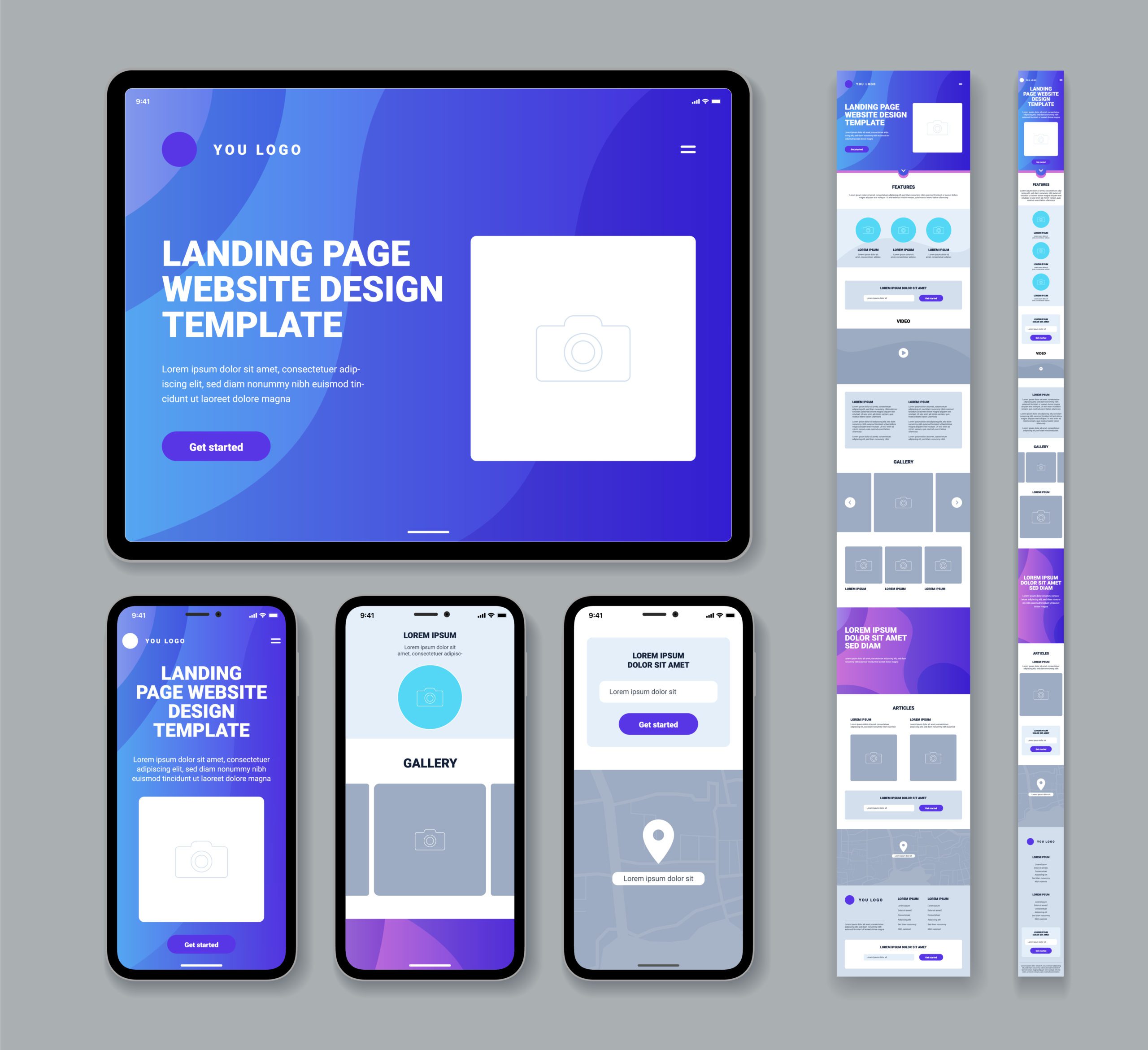
In today’s digital landscape, where users access websites on a multitude of devices, responsive web design has emerged as a fundamental approach to crafting websites that adapt seamlessly to different screen sizes and devices. With the ever-increasing usage of smartphones, tablets, and various other gadgets, it is imperative for web designers and developers to create user-centric experiences that transcend device boundaries. In this comprehensive guide, we will explore the principles, techniques, and best practices of responsive web design to equip you with the knowledge and skills needed to create websites that deliver optimal user experiences, regardless of the device being used.
In the dynamic world of web design, responsive design goes beyond simply resizing and rearranging content. It encompasses a holistic approach that takes into account factors such as accessibility, performance, and aesthetics, all aimed at providing a seamless and enjoyable experience for users. As technology continues to evolve, so do user expectations, making responsive web design an essential aspect of modern website development.
So, whether you are a seasoned web designer seeking to brush up on the latest trends and techniques, or a novice looking to embark on the exciting journey of web design, this guide will provide you with an understanding of the concepts and tools necessary to create stunning, engaging, and highly functional websites in the ever-evolving digital landscape of 2023. Get ready to dive deep into the world of responsive web design and unlock the secrets to crafting websites that captivate and delight users across all devices.
What is Responsive Web Design?
Responsive web design is an approach to web design that seeks to create websites that are optimized for all devices, including desktops, tablets, and mobile devices. This means that the design layout, content, and functionality adjusts automatically based on the screen size and orientation of the device being used to access the website.
In practice, a responsive web design means creating a fluid and flexible design that works seamlessly across different devices, without requiring separate sites or versions for each. This is accomplished through the use of a flexible grid systems which adapts to different screen sizes, optimizing images, and responsive breakpoints that control how the page layout changes at different screen sizes.
The goal of a responsive website is to provide a consistent and optimal user experience across diverse devices, allowing the user to access the same content and features regardless of the device they are using. This is particularly important for mobile devices, which have become a ubiquitous part of our digital landscape. A mobile-friendly website ensures that potential customers have a seamless experience on their mobile devices, improving satisfaction and ultimately conversion rates.
Over the years, responsive design has evolved to become more accessible and easier to implement. Design experts and developers now have access to a wide range of tools and frameworks that streamline the development process. Additionally, the rise of no-code programs has democratized the creation of responsive websites, allowing for even novice designers and laypeople to create mobile-friendly websites without needing to know how to code.
In conclusion, responsiveness is essential for designing websites that are accessible and optimized for all devices, including desktops, tablets, and mobile devices. By focusing on user experience and accessibility, designers can create websites that are responsive, easy to use, and ultimately more effective at engaging and converting visitors.
5 Reasons Why a Responsive Website is Important
In this digital landscape, mobile devices have become the primary tool for browsing websites. As more mobile users access websites from screen sizes ranging from miniature phones to large tablets, designing a website that is responsive has become critical. Responsive web design refers to creating websites that adapt to the user’s device, providing optimal user experience by ensuring the website layout and design elements are consistent across a wide range of devices. In this article, we’ll explore 5 reasons why a responsive website is crucial for your business.
1. Enhanced Visibility and Increased Reach
In today’s world, a website’s responsiveness plays a significant role in its success. Mobile devices have taken over the majority of web searches, which means that a non-responsive website will not cater to all screen sizes, resulting in a sub-optimal user experience. This is why it is critical to have a responsive design that can adjust to a wide range of devices.
A responsive website not only enhances a business’s visibility but also helps them reach a wider audience. By catering to mobile users, businesses can tap into a massive audience that is constantly on their phones. This means that potential customers can easily access a business’s website, regardless of their device. This leads to increased reach, as businesses can provide a consistent experience across various screen sizes, ensuring that all users have access to the same information.
In conclusion, the benefits of a responsive website design are far-reaching. By catering to mobile users, businesses can improve their user experience, increase their search engine rankings, and reach a wider audience. With design experts keeping responsiveness in mind during the development process, businesses can ensure faster loading times, seamless user experience, and conversion rates that can lead to higher profits.
2. Improved User Experience
Improved user experience is another critical benefit of a responsive website. A responsive design ensures that all design elements adapt seamlessly to any screen size, making it easier for users to navigate the website and find relevant information. This creates a positive user experience that helps to retain customers and encourages them to return in the future. As we increasingly rely on mobile devices to access information online, creating a website that is easily accessible on mobile devices is no longer a luxury, but a necessity. Having a responsive website design is vital for ensuring a positive user experience.
Website owners who fail to invest in responsive web design may face negative consequences. A website that is not mobile-friendly can be frustrating for users who have to zoom in and scroll around to view content. Furthermore, it can create an unprofessional and untrustworthy image of the company, which may negatively impact potential customers.
Responsive web design can eliminate such frustrations by ensuring that the website looks and functions beautifully on mobile, tablet, and desktop devices. With a responsive design, users no longer have to struggle to see entire pages. The content is displayed in an optimal manner, making it easier and quicker for users to view, engage with, and share. Therefore, a responsive website can create a more positive impression of the company and increase customer satisfaction.
3. Improves Search Engine Optimization (SEO)
One of the main benefits of responsive web design is its ability to improve search engine optimization (SEO). With the majority of internet activity happening on mobile devices, Google has shifted to mobile-first indexing, which means that it first crawls the mobile version of a website to determine its relevance and rank it on search engine results pages. Which, in return, means that businesses with non-responsive websites may have a lower search engine ranking and therefore a lower visibility.
With a responsive website that is optimized for mobile devices, businesses can rank higher in search results, increasing visibility and bringing in more traffic to their website. Having a responsive website design ensures that your website is easily accessible to mobile users and that its content can be effectively crawled by search engines.
By embracing a responsive web design, businesses can create a user-friendly and accessible online presence that caters to the ever-growing mobile user base while enabling search engines to effectively crawl and index their content. Embracing this approach not only enhances the user experience but also establishes a solid foundation for SEO success in today’s mobile-centric digital landscape.
4. Time Efficient and Easy Maintenance
As mentioned, when a website has a responsive design, it means that it can effortlessly adjust to different screen sizes, ensuring that users have a seamless experience no matter what device they might be using. This “one-size-fits-all” approach to website design is beneficial for several reasons.
For starters, having a single website that caters to all devices saves time. In the past, website owners had to create separate sites for desktop and mobile users, which was both time-consuming and costly. With responsive web design, there is no need to manage multiple site versions, which directly translates to cost-saving in the development process.
From a maintenance perspective, having one website that can be easily updated and managed is much more convenient than dealing with multiple versions of a site. When site updates are required, content managers can update a single piece of content that modifies the responsive layout across all devices. This ease of updating a single piece of content saves a considerable amount of time and effort, leaving more time to focus on creating fresh and engaging content.
Another important aspect of responsive web design is the future-proofing opportunities it presents. As technologies shift, new screen sizes will emerge. With responsive design in mind, designing to adapt to these changes is much easier. This means a responsive website design can cater to a wide range of devices, which translates to a consistent user experience for visitors on all screens. Additionally, this future-proofing approach to designing ensures that website owners and designers don’t have to start from scratch every time a new device, feature, etc. is released.
Responsive web design provides a range of benefits that go beyond search engine rankings and user experience. It saves time and effort in the design and development process, lowers maintenance costs, and future-proofs the website design against screen size changes. If you prioritize optimal user experience, customer satisfaction, and conversion rate, then implementing responsive web design is the way to go.
5. Competitive Advantage
As the digital landscape continues to evolve, businesses need to stay competitive by providing an exceptional user experience to their visitors. One crucial element that sets businesses apart from their competition is having a responsive website. In 2023, the importance of a responsive website cannot be overstated.
A responsive website gives businesses a competitive advantage by providing a seamless user experience across a wide range of devices, including mobile phones, tablets, and desktops. A responsive design enables businesses to attract and retain visitors by providing a consistent experience no matter what device their customers use. This boosts the chance of visitors staying on the website for a more extended period and ultimately converting into potential customers.
Having a responsive website goes beyond just catering to mobile users – it offers businesses a competitive advantage by improving SEO, increasing load times, reducing costs, and ensuring a seamless experience. It’s no longer just an option but a necessity for businesses that want to succeed in the digital age. With design experts keeping responsive design in mind, businesses can establish themselves as an industry leader by offering a consistent and optimized user experience.
5 Tips on How to Make Your Website Responsive
Having a responsive website in today’s world is more important than ever. With a wide range of devices available to users, it’s crucial to ensure that your website delivers a consistent experience, no matter the screen size. In this article, we will be discussing five tips on how to make your website responsive, with design experts in mind. From simple planning to necessary tasks, incorporating these practices into your development process can lead to faster loading times, higher search engine rankings, and ultimately, a seamless user experience for potential customers. Creating a responsive design may seem intimidating, but with the right tools and techniques, it can be achieved with ease. Here are 5 tips on how to make your website responsive.
1. Plan Your Design and Layout Beforehand
When designing a responsive website, it’s crucial to plan your design and layout beforehand. This involves sketching out the general structure and considering how it will adapt to different screen sizes. By planning ahead, you can ensure that your website is well-organized, aesthetically pleasing, and functional on all devices. Placement of elements like the logo, navigation, and calls-to-action should be considered along with the order of content and negative space required. This process helps to create a smooth and seamless user experience while building a responsive layout.
2. Take the “Mobile First” Approach
Mobile devices have revolutionized the way we access and consume digital content. As a result, businesses need to have a mobile-first approach in designing their websites to cater to the needs of their mobile users. Taking a mobile first approach in web design means prioritizing the mobile experience over the desktop experience. This design philosophy allows for optimal website optimization for a growing number of mobile users, resulting in an improvement of the overall user experience. By designing for mobile devices first, then scaling up to desktop devices, designers can ensure a seamless experience across a wide range of mobile devices and screen sizes.
3. Keep Navigation in Mind
When it comes to responsive web design, navigation should be tailored to the device being used and the browsing behavior of mobile users. Navigation bars on laptops tend to consist of multiple menu items, whereas mobile devices require a more simplified and intuitive approach, such as a hamburger menu. To create a better user experience, it’s important to focus on using clear labels and easy-to-access menus, and simplifying navigation wherever possible. By making your website mobile-friendly and ensuring that navigation is intuitive for all users, you can boost engagement, improve overall satisfaction, and ensure your website is responsive.
4. Take a Minimalistic Approach
Taking a minimalist approach in web design is crucial for ensuring fast loading times, clear navigation, and an uncluttered user experience. By limiting the number of design elements and focusing on simplicity, a site can increase its responsiveness and create a more consistent experience across a wider range of devices. Additionally, minimalistic design can improve the overall functionality of a site and decrease the bounce rate, ultimately leading to greater customer satisfaction. It’s important to prioritize a minimalist design in the development process and keep the user experience in mind to ensure a successful, responsive website.
5. Aim for Accessibility
Accessibility is an essential component of responsive web design. This means that the design of a website should allow for access to all individuals, regardless of their abilities. An accessible web design applies the four principles of web accessibility – perceivable, operable, understandable, and robust. To make websites even more accessible, it is crucial to offer options such as the use of swipe actions for mobile users, designing larger buttons and clickable content, and ensuring that content is optimized for screen readers. Aiming for accessibility in your web design is a great way to create a seamless experience for all users.
Examples of Responsive Websites (2023)
Nowadays, more and more companies are implementing responsive designs to their websites. This is because with the proliferation of mobile devices and screen sizes, websites need to cater to a wider range of users to provide a consistent experience. From fluid layouts to adaptive images, responsive design is changing the digital landscape and setting the industry standard for customer satisfaction. Let’s take a look at some examples of how companies are implementing responsive websites.
1. Amazon
Amazon, one of the largest ecommerce stores in the world, excels in providing an excellent user experience thanks to their responsive design. Their user interface seamlessly adapts across all devices, making it easy for users to shop on any platform, including desktops, tablets, and mobile phones. The tablet layout removes extra white space and adds a scrollable section of icons to fit more content into a smaller package. The mobile layout focuses on the essentials, such as recent purchase history, and moves to a single column design. These adaptations improve the user experience and increase accessibility for all users, making Amazon a leading example of the benefits of responsive design in ecommerce.
2. Dropbox
Dropbox is another well-known example of a responsive website that offers a seamless user experience across a wide range of devices. One of its key elements is the use of fluid grid colors, which adapt to different screen sizes, ensuring a tailored visual experience. Dropbox also utilizes flexible visuals to enhance the aesthetics and readability of its website on mobile devices. This focus on responsive design not only improves the user experience but also helps improve search engine ranking, customer satisfaction, and conversion rates.
3. Dribbble
Dribbble is a popular social networking platform for designers and creative professionals to showcase their work, collaborate, and network with others. The website exemplifies responsive design with its simple and flexible layout that adjusts to fit various screen sizes, including mobile devices. Despite its simplicity, Dribbble still provides a visually appealing experience by using images and videos that follow logical proportions, making it easy to navigate and interact with content. This approach to design not only enhances the user experience but also allows Dribbble to maintain a consistent look and feel across a wide range of devices and platforms. Overall, Dribbble’s responsive design is a testament to how simplicity and flexibility can create a visually stunning and user-friendly experience.
Conclusion
The importance of a responsive website cannot be overstated, as it can greatly impact a user’s experience and a website’s overall success. By implementing a responsive design, businesses can attract more mobile users, boost their SEO performance, and increase their conversion rates.
A responsive web design ensures that your website adapts to different screen sizes, operating systems, and devices, providing an optimal user experience. With a mobile-first approach, businesses can cater to the wide range of devices available in the digital landscape. This can lead to increased customer satisfaction, lower bounce rates, and faster loading times, ultimately leading to higher conversion rates. Additionally, responsive websites are favored by search engines, resulting in higher search engine rankings and increased business visibility, leading to better SEO performance.
In conclusion, a responsive web design is an essential aspect of website development in 2023. Businesses must keep the design elements and user experience in mind to create a consistent experience across all devices. With the help of a responsive design, businesses can attract a broader audience and increase their overall success in the digital marketplace.